Photography Tips | Why Some Photograph Should be in Colours?
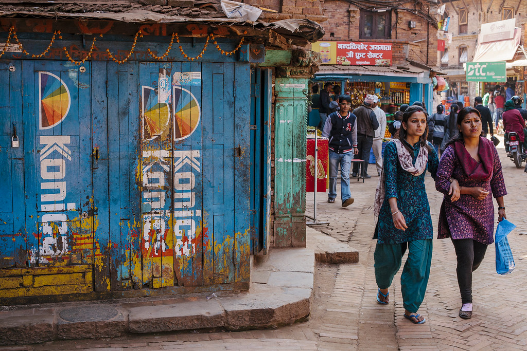
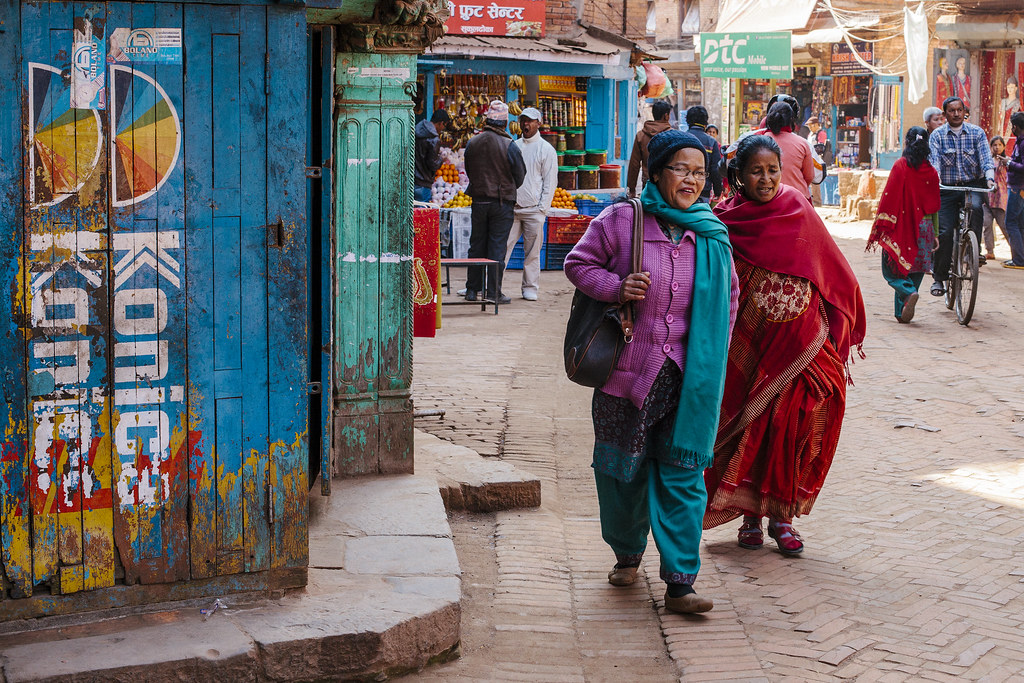
© 2014 Wazari Wazir | People Walking on The Street of Bhaktapur | Nepal
Canadian, photojournalist, Ted Grant once said, “when you photograph people in colour, you photograph their clothes. But when you photograph people in black and white, you photograph their souls!”. Yes, most of the times it’s true, especially regarding people photography but it is not always true. Sometimes by photographing people in colours, with their colourful clothing, you also photograph their belief, their cultures, ethnics, race and religion as well.
Take a look a of photograph of people during Holi Festival in India, Holi Festival is Indian Festival of Colors, where people dance and celebrate and throw coloured powder at each other. I think this kind of event doesn’t look great in black and white, no matter how great your black and white photoshop skill is, those event rarely work great in black and white, but then off-course, who am I to argue about your taste.
Sometimes it can be difficult, to make a decision, whether a photograph should look great in colours or black and white, I’ve the same problem too, but regarding the photograph above, which I took in Bhaktapur Nepal, I think it work great in colours, what attract me the most when photographing this scene is the blue colours of the rustic wooden doors there painted with Konica Logo, I think some of you guys, or newcomer in photography doesn’t know what Konica brand is.
Konica is more or less like Kodak, a company which produce film and camera but since August 2003, the company merged with Minolta to form KonicaMinollta, but In 2006, Konica Minolta Holdings exited the photography business. In March 2006, the merged company closed down its photo imaging division, which produced colour film, colour paper, colour paper, photo chemicals and digital minilab machines.
Anyway I like the colours of the Konica logos there, back in the film days, it is the colours of their logos that separated their 35 mm film box from the rest. Kodak is known for its yellow box, while Fujifilm is remembered with their green box. Colours can show more about people, places, brands and a lot more. Actually I like the faded colours of Konica logos there, what I didn’t like is, the company is no longer exist.
If you look closely at the blue coloured wooden door there, behind the Konica Logo, is yellow coloured Kodak Film advertisement, they shared the same space and they also share the same fate. If I share this photographs in black and white, I believed you’ll hardly notice it.
Have you ever wondered why Steve McCurry primarily shoot in colours, here’s his answer :
Most of the time I’m not looking for color pictures. I am looking for something interesting, for a vignette that tells a story, something that reveals an element of humanity. Color is secondary.
Often you need just two or three colors. I think there’s a balance between having something completely monochromatic and having over-the-top color that is just too much or has too many different colors.
A red bucket in the background can spoil a color picture. A red bucket in a black and white photograph is a gray object. You have to edit yourself as you shoot. In some ways shooting black and white is easier because you don’t have that extra problem of color to solve.
There must be a flow and a balance not only of color but also of composition. Then there comes a point at which things make sense and come to rest.
– Steve McCurry –


