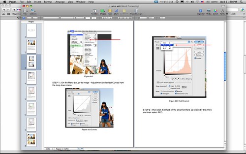
Photoshop | eBook | Getting The Tones


Some people may like it and some people may hate is especially those who are too concern about perfect skin tone. So my e-Book is not for them, my e-Book is for those who have never fear to express themselves. Colors play an important part in our life, some people doesn’t care to pay for a higher price on their cars for a specific colors and design, the car and engine is still the same but they make a big decision on colors. For me personally I’m very particular about colors, like choosing my camera bag, I’ve a Crumpler bag, and I don’t like black so I’ve to wait for a few month to get my colors, something in between Grey and Green.
My point is people can be so choosy about colors. back to my color tone and why I like to play with tone is this, very simple explanation, certain colors really can enhance a mood on a pictures, all pictures, sometimes mute or fade colors picture work great with portrait where there is some kind of emotional feeling into it, for an example a picture of an old man looking through out of a windows, longing for something, this type of a picture will work great without too many colors that will distract a viewer from “the mood”. So either convert those picture onto black and white, sepia or just fade their colors a little bit will do the job, will bring our attention straight to “the mood”, to the “feeling” of loneliness.
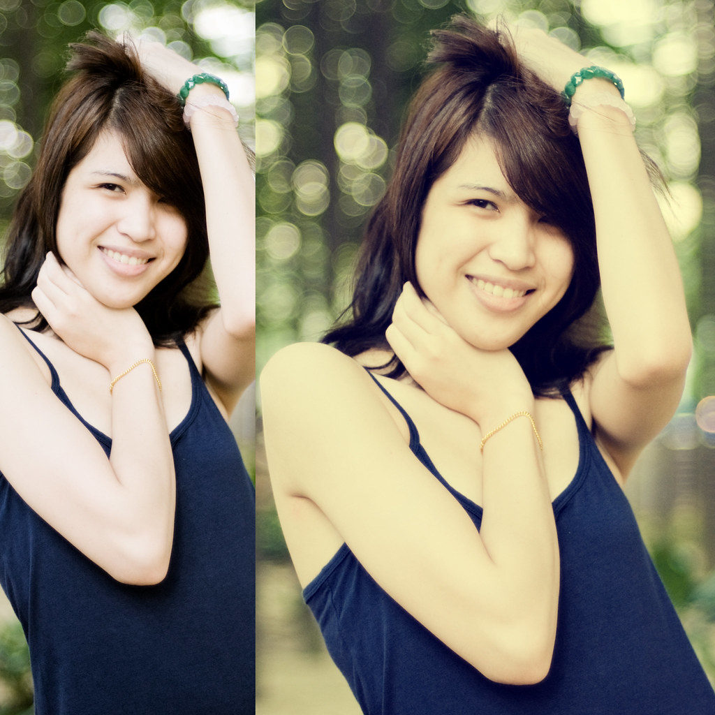
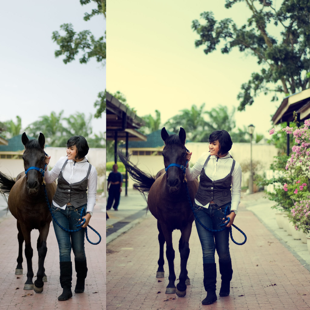
We should know when the colors may work and when the colors can become a distraction. For a light heart moment or some kind of a warm feeling I like to add more yellowish or orange tinted colors on my pictures to create more “warmth feeling” onto it. It is not as simple as add more yellow or just bump up the saturation, you won’t get that kind of tones, I’ve try that, so my e-Book will guide you through how to get that kind f tones. I’ll show you the way, the way that most people can understand, as simple as it can be.
Lately there is a trend where people especially here in Malaysia are more aware or starting to pay close attention to the tones, I’ve often get comments something like this, “Nice Tones”. It’s not easy to describe about “Nice Tones” you just absorb it unconsciously. People in United State or from European Country have been using the tones long time ago, from film to digital, I like their tones and it is not because I want to be something like them but I want my picture to have a “feeling”. Normal picture without any color tones into it, is just normal, maybe it is a picture of sadness but without the right combination of colors, the mood wasn’t so strong.
For an example a picture of a crying with a bright colorful cloth and a picture of a crying child in black and white will have a different kind of mood, sure enough the picture in a black and white hold much stronger emotional feeling than those in a bright colorful photograph, even though it is same kind of a picture, the feeling is not the same.
Colors can show happiness and colors also can also show sadness. Our life can be so colorful or just monochromatic. Just click the link below to find out more…
Get The Secret HERE

6 Comments
NAZRI AHMAD
bro..tlg update if this ebook dah siap
thanx
dian nais
salam.. Insya Allah saya akan laburkan sedikit pendapatan untuk memiliki ebook ini.. tahniah dan terima kasih
punk5hitam
salam sayang bro…me doing exhibition with you…!!! its like a dream come thru…lets make this a reality…its an honour to me…thanks sifoo
farhanjamil
hahaha update la harge skali n i like your mate berkilat touch on haiqal huhu nice abis. ade ke dalam buku tu nnt hahahah
wazariwazir
Farhanjamil, e-Book saya tiad tutorial tentang “mata berkilat” yang ni hanya permainan tone warna, seperti contoh gambar di atas, permainan tone warna. Tentang editing “Mata Berkilat” tu, InsyaAllah mungkin untuk e-Book yang akan datang…
brian
i love the tones in these, especially the last two. It looks like something that I’ve been trying to do. nice.